It would be an absolute dream if I could create type specimens every day.
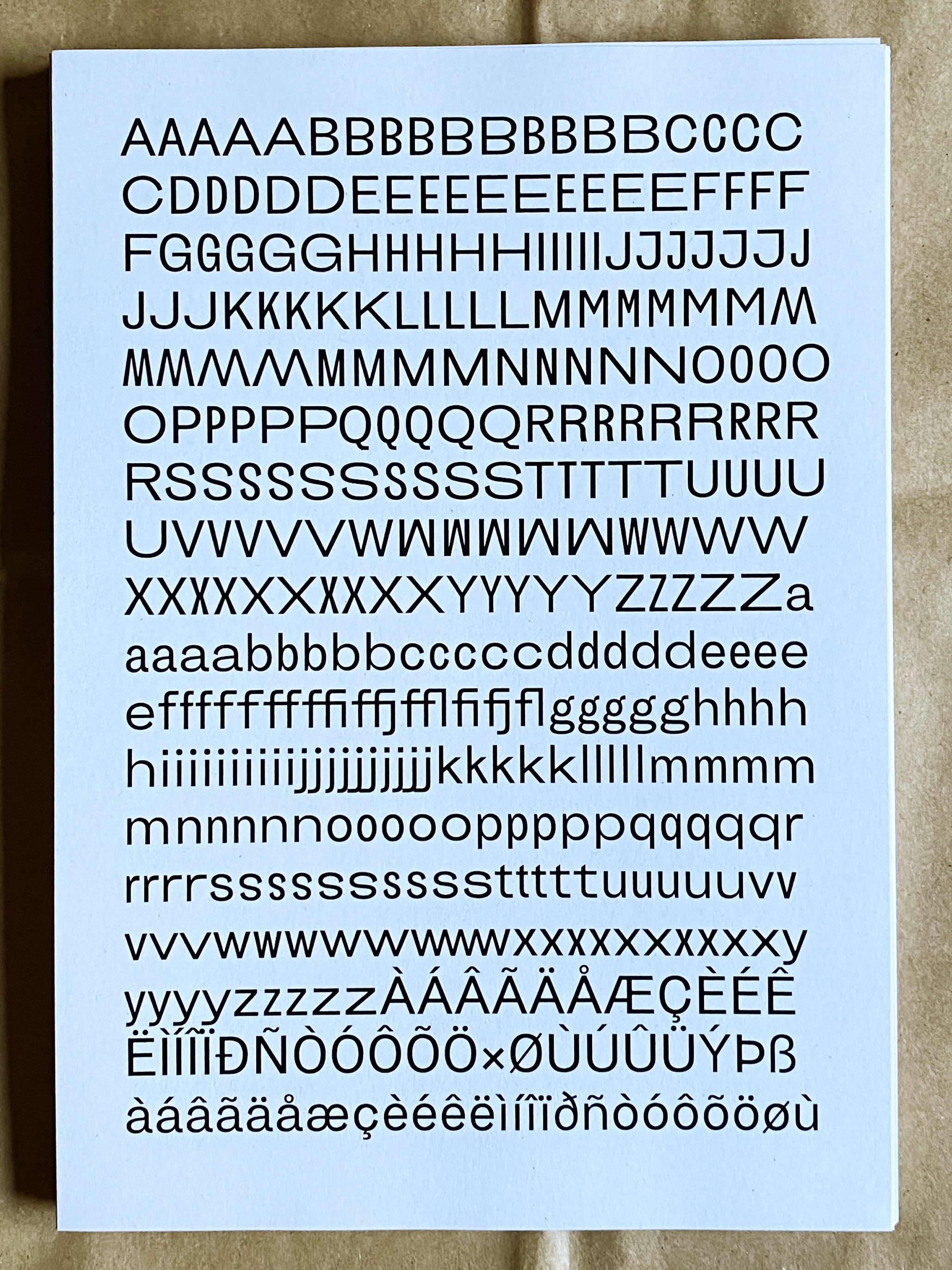
Type specimens exist to show us a typeface in all its glory; its weights, its character quirks, and extensive (or not) glyphs.
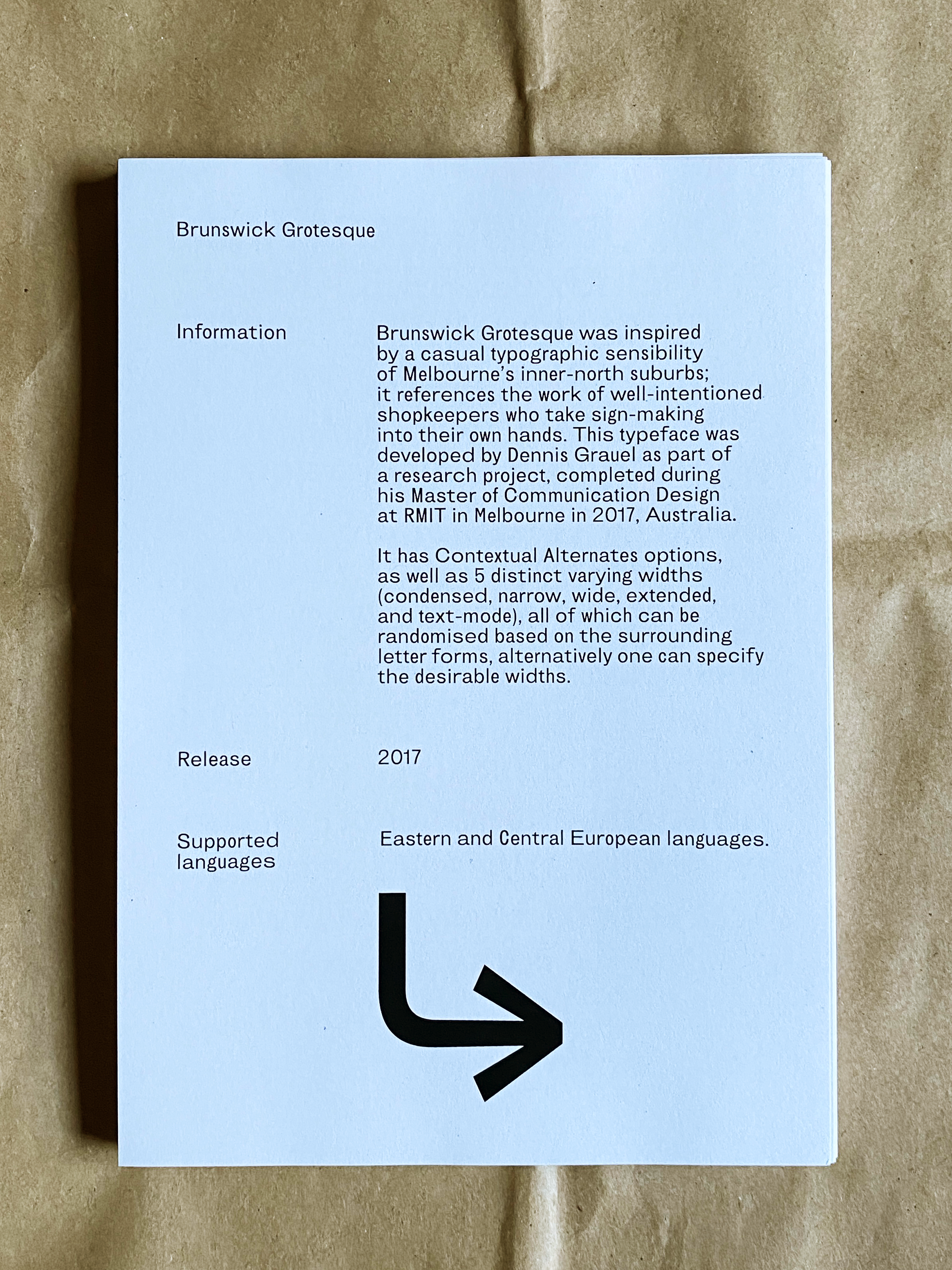
This project was particularly special, as Dennis Grauel developed Brunswick Grotesque as part of a thesis project undertaken during his Masters of Communication Design at RMIT (2017).
Brunswick Grotesque was created from a curiosity towards developing a typeface that “communicate[s] a sense of place” (Dennis Grauel, Designing A Typeface For Brunswick, (Melbourne: 2017).
In particular, Grauel's focus was the vernacular typography found in Melbourne’s inner-northern suburbs, namely Brunswick.
Referencing the long lineage of migrant shopkeepers, "who take sign-making into their own hands.” (Dennis Grauel, his website).
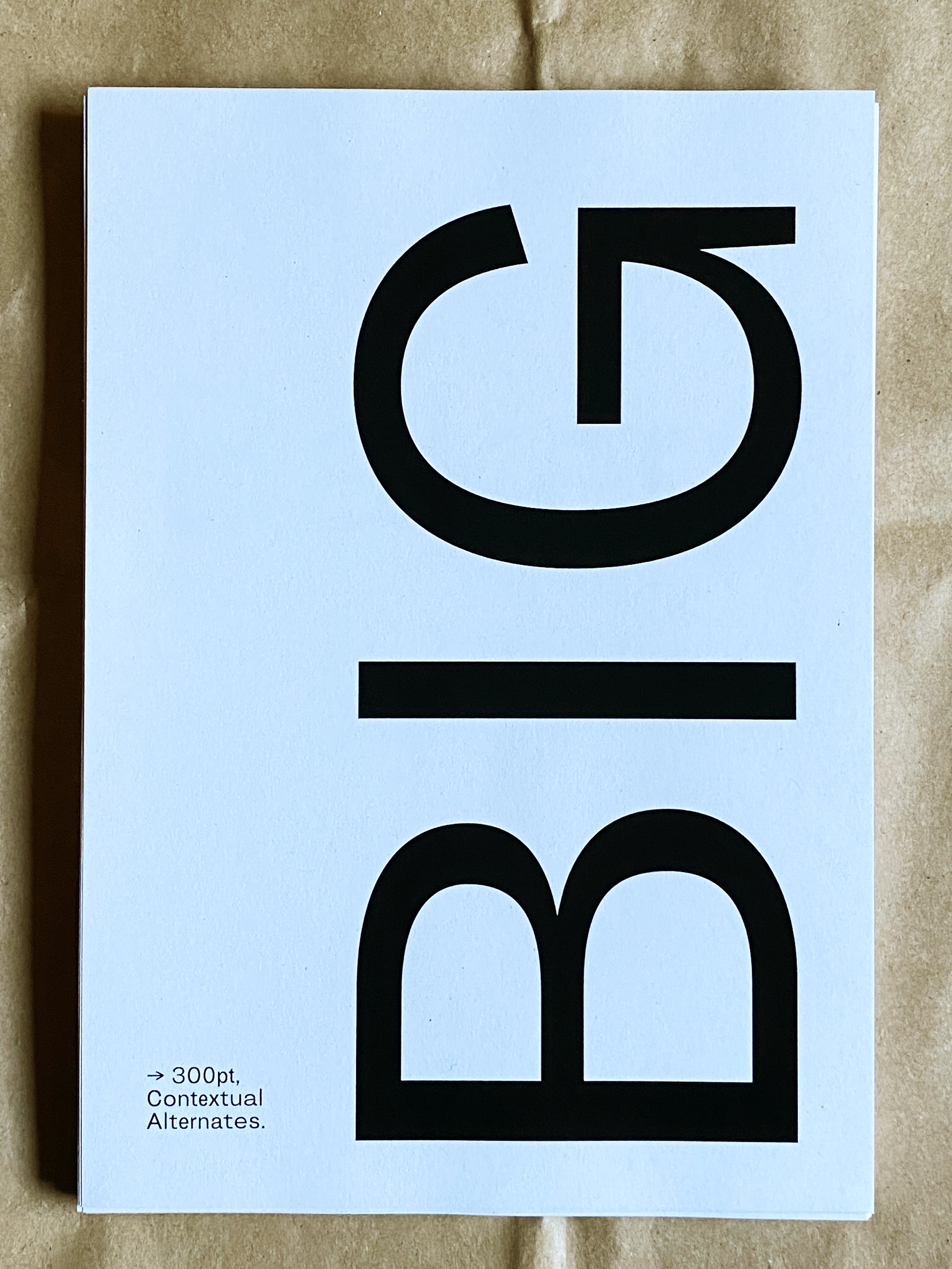
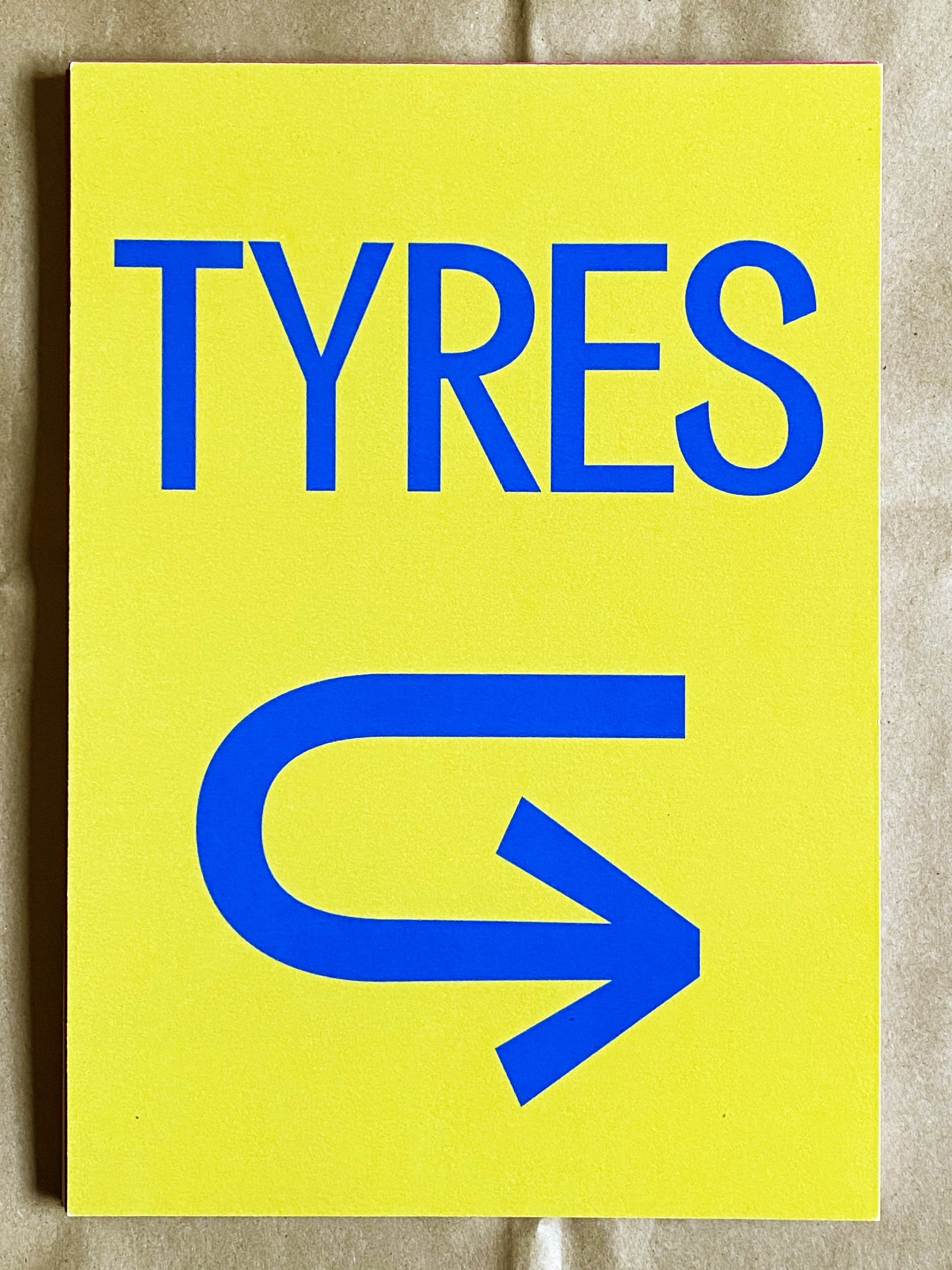
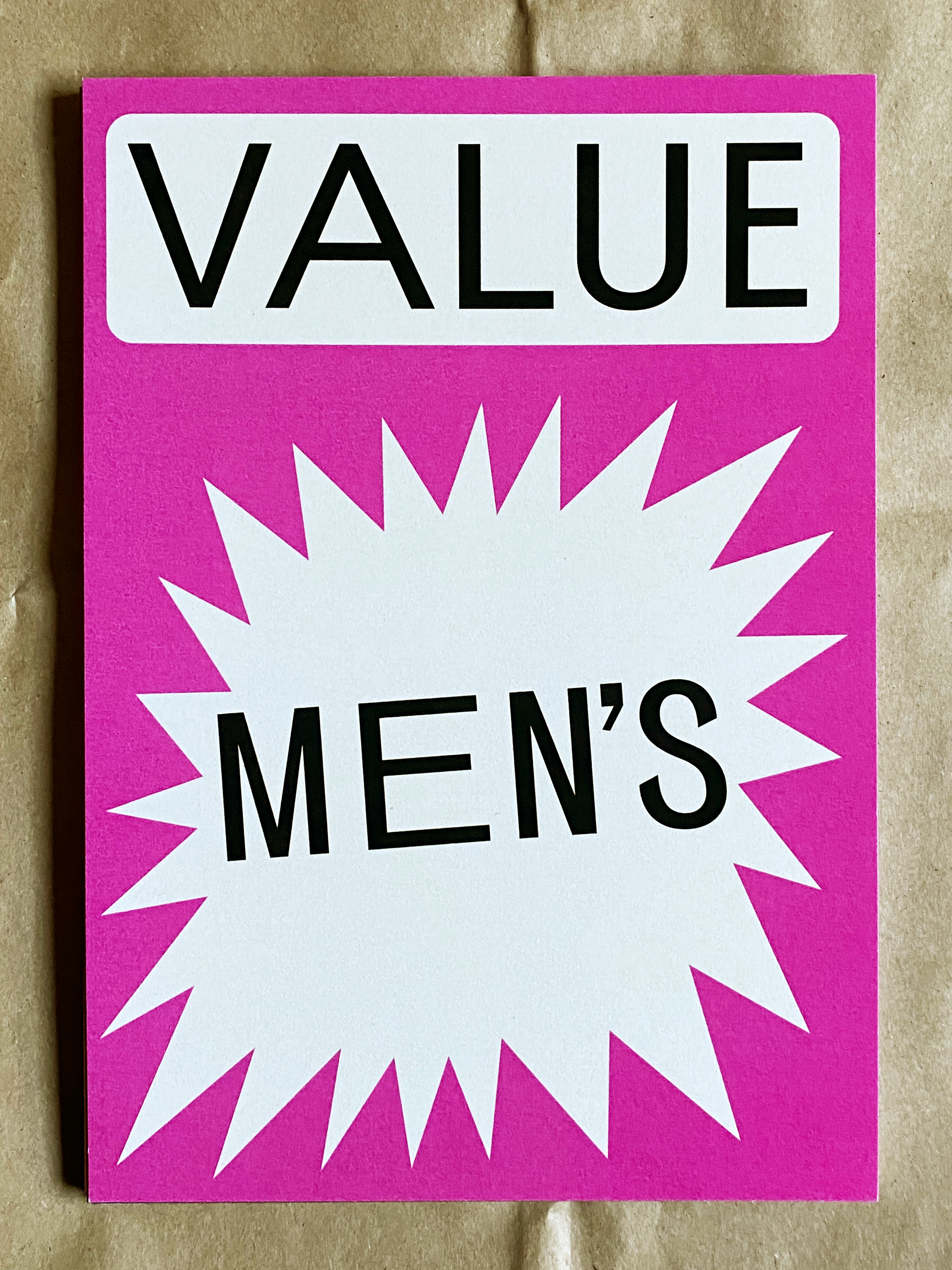
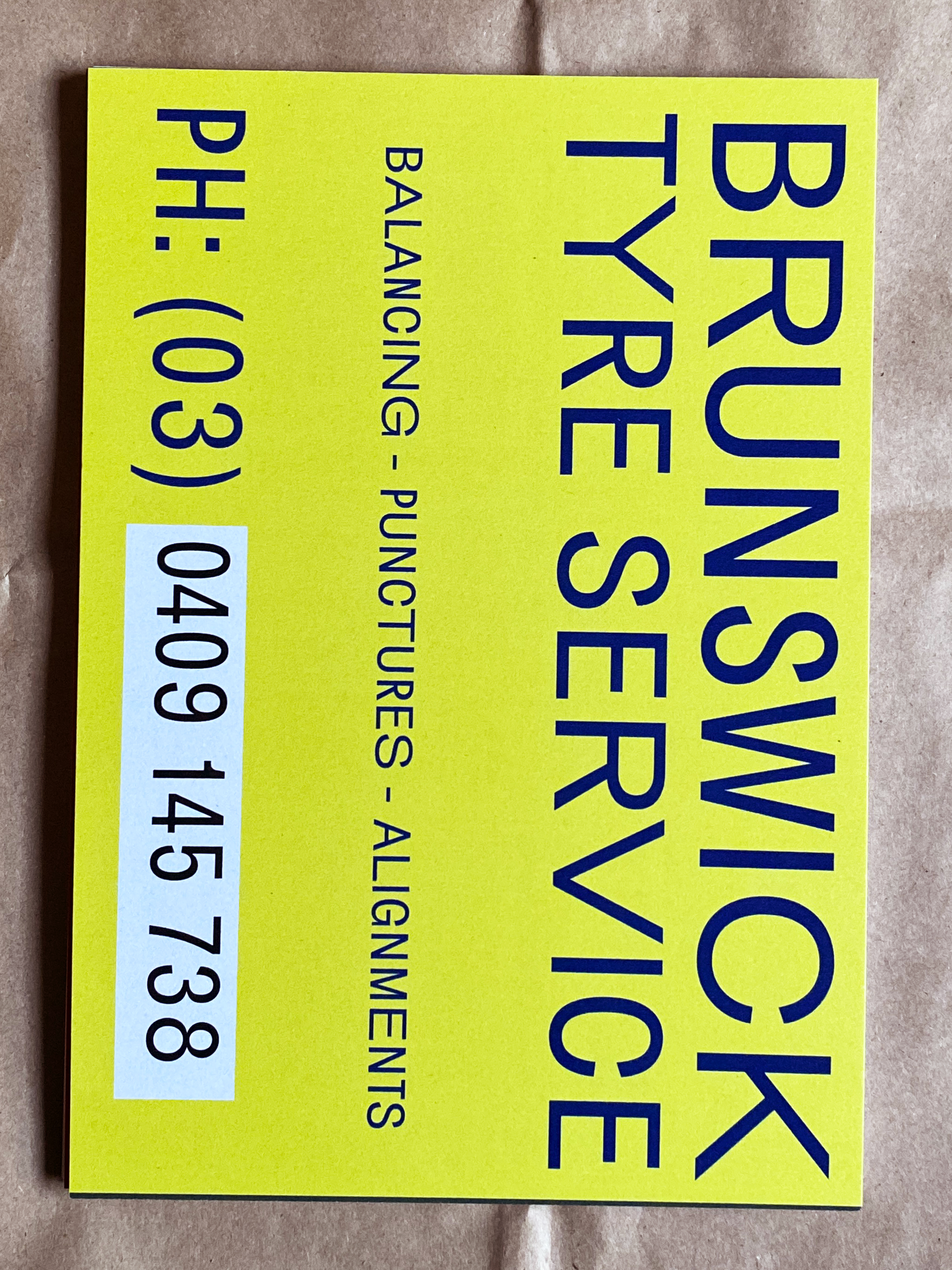
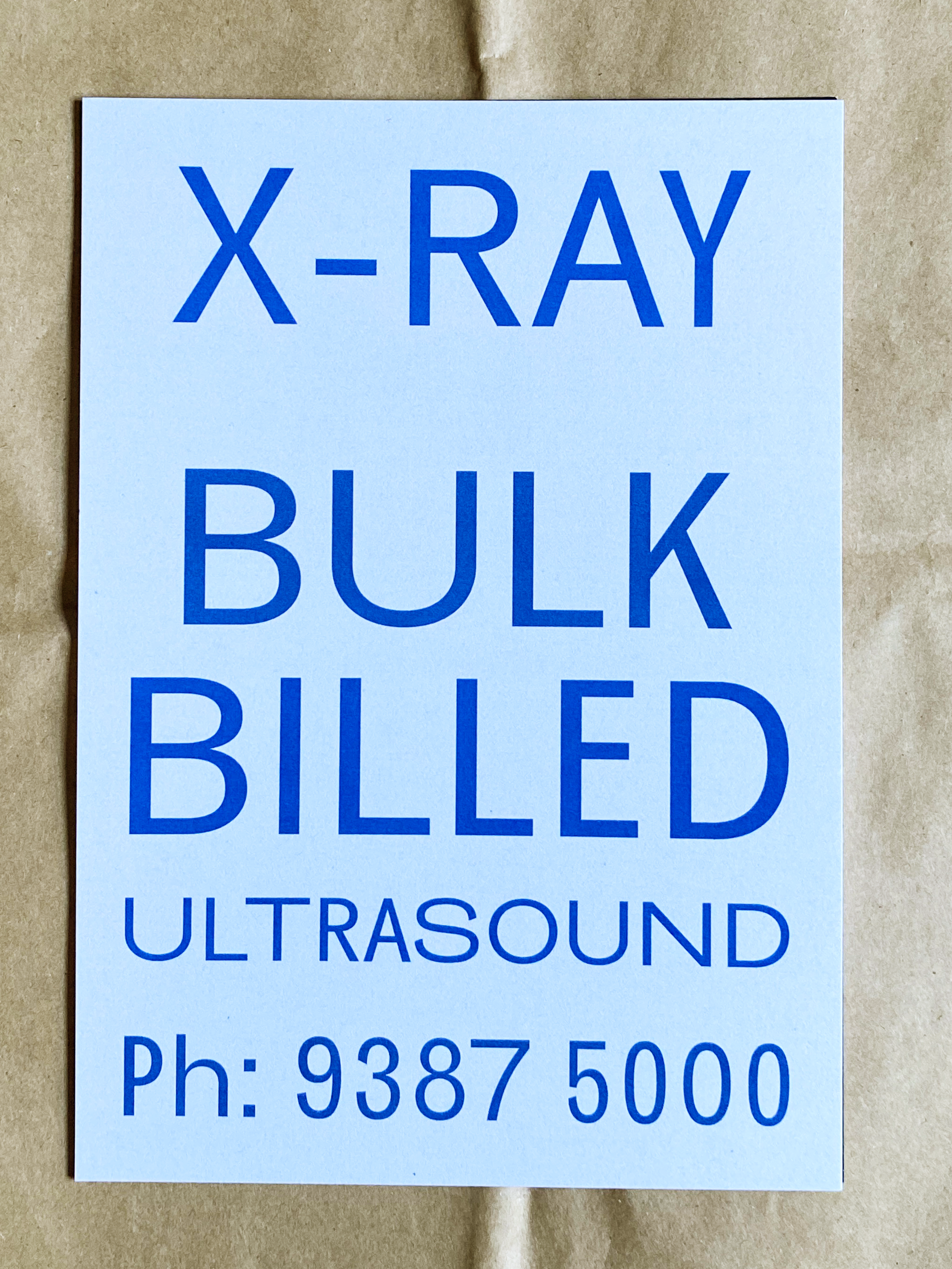
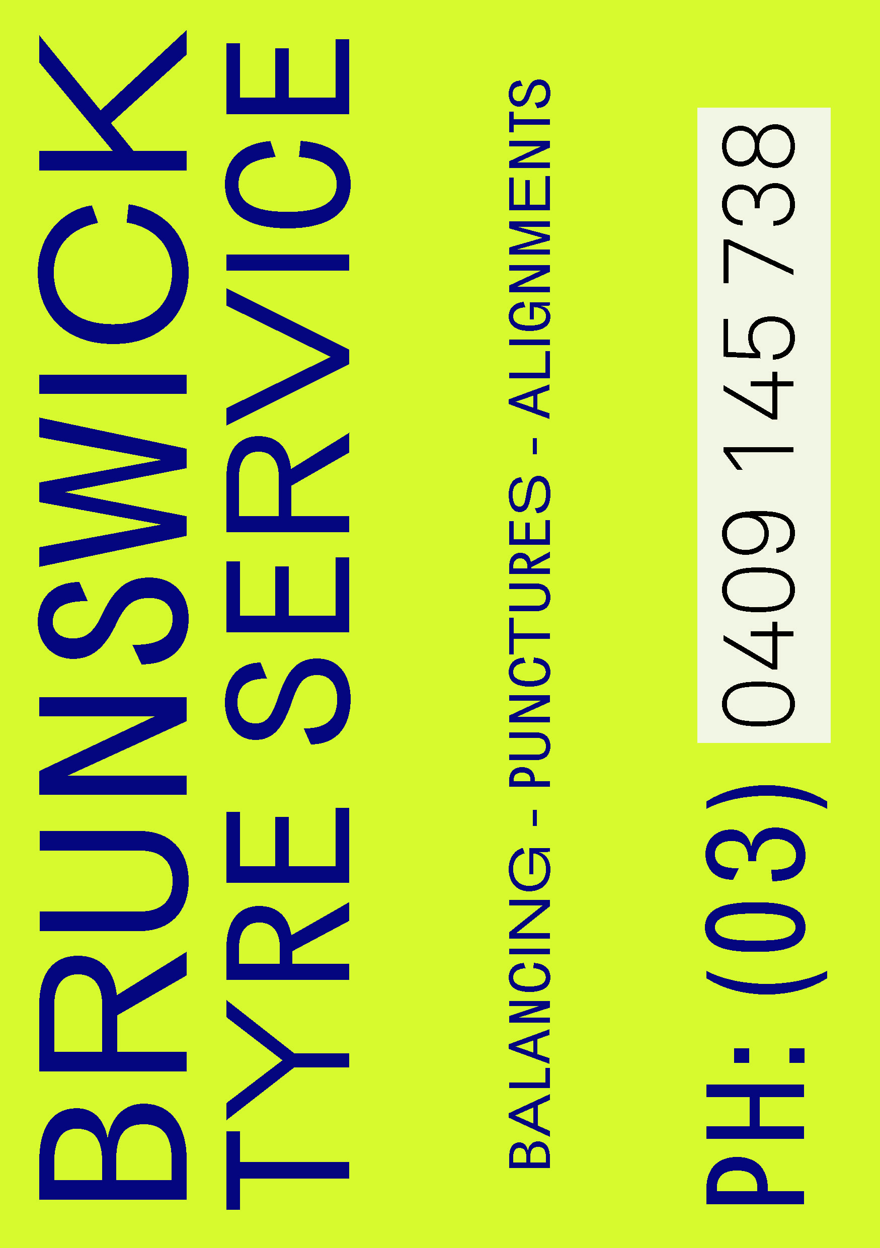
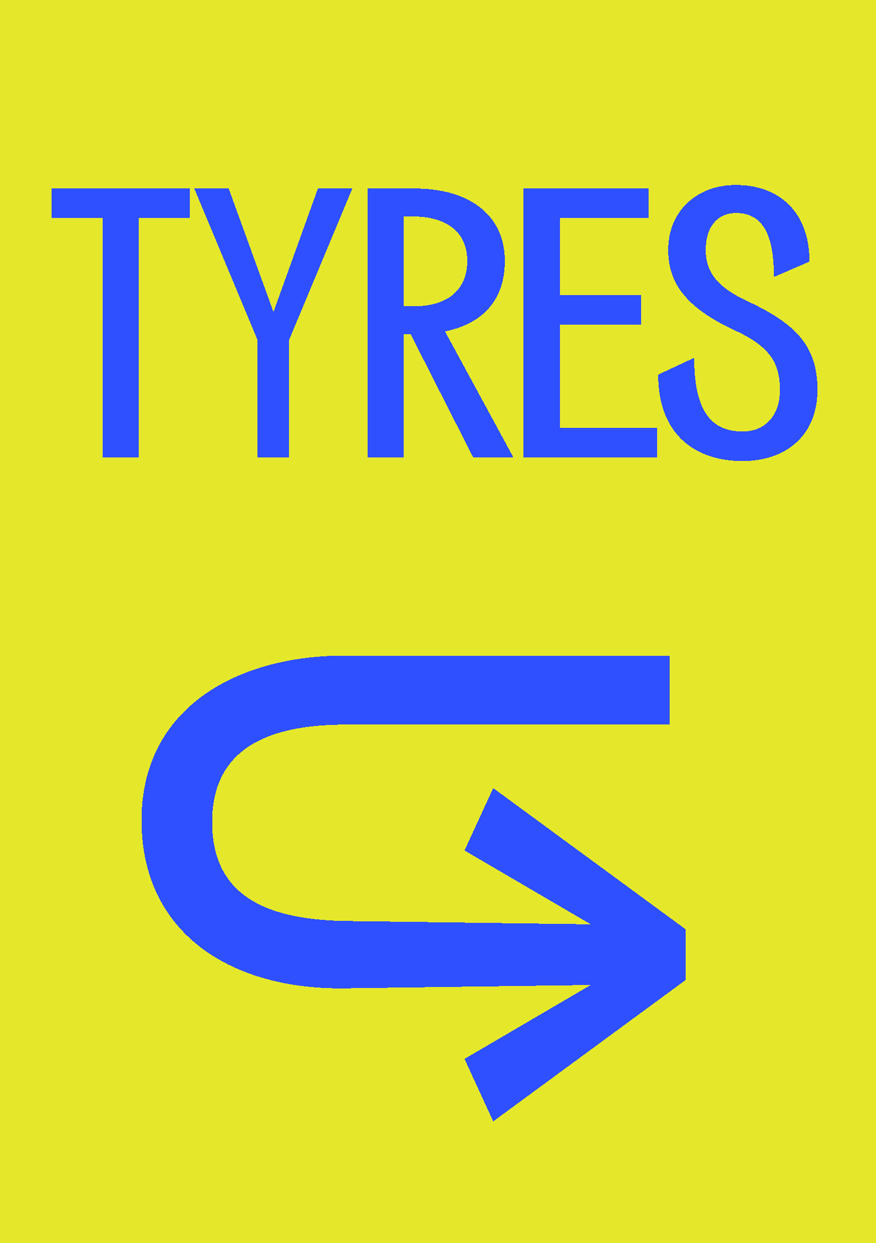
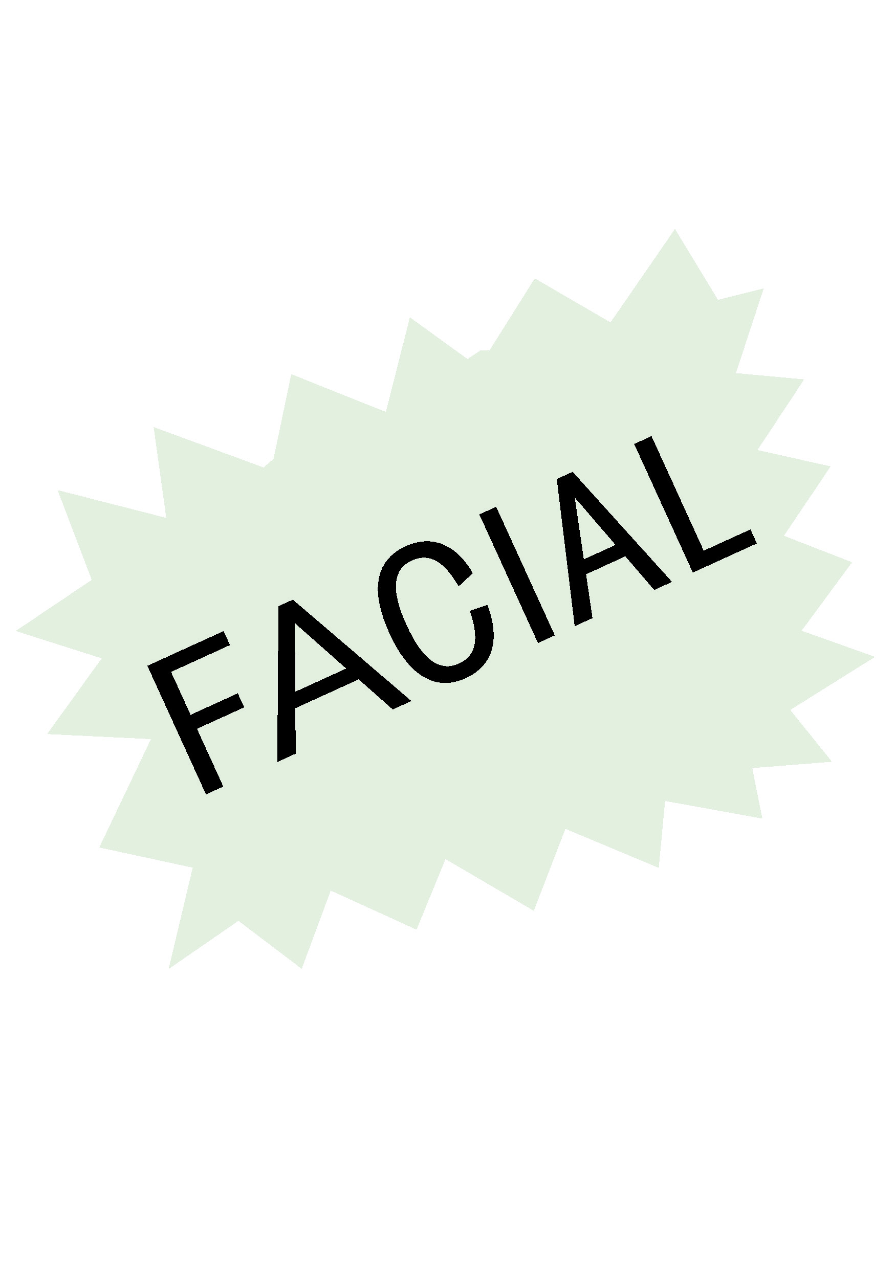
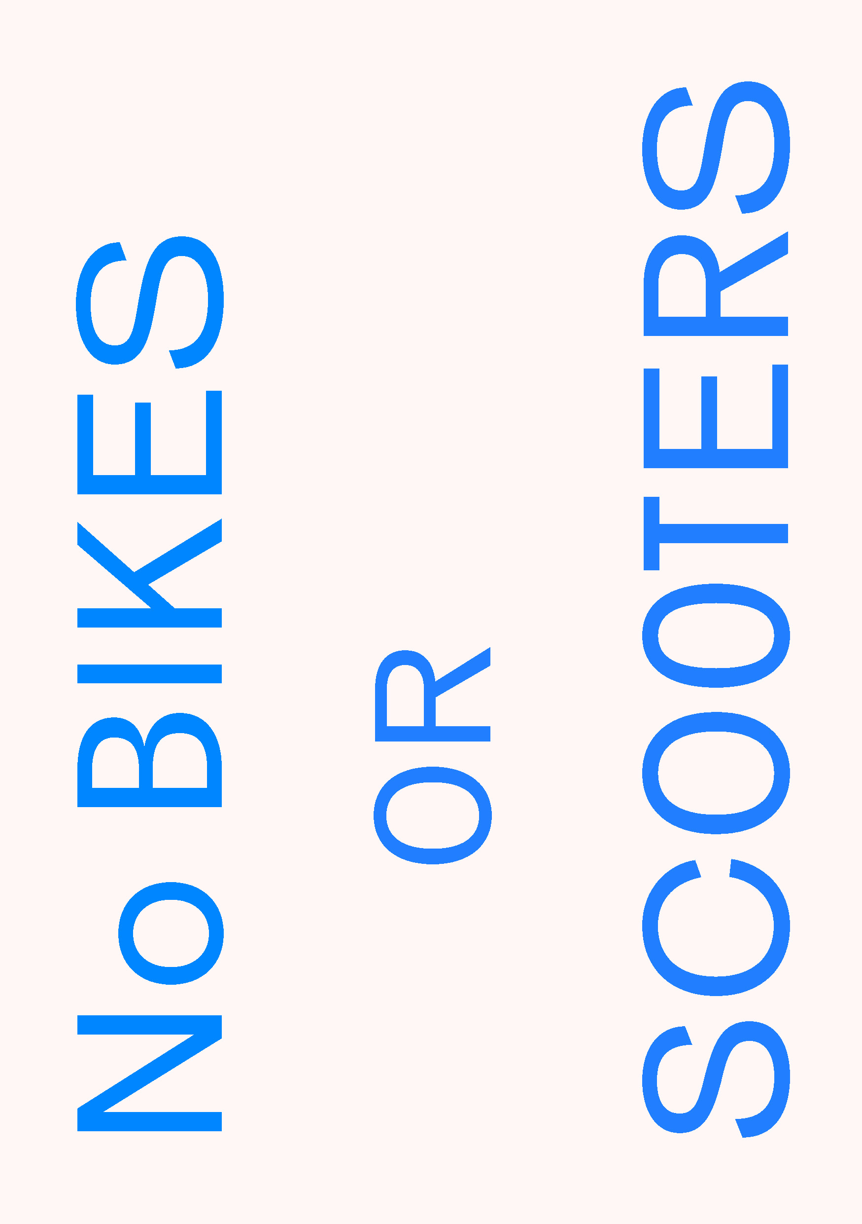
This specimen showcases Brunswick Grotesque in your traditional design settings, using grids, margins, and your typical design conventions.
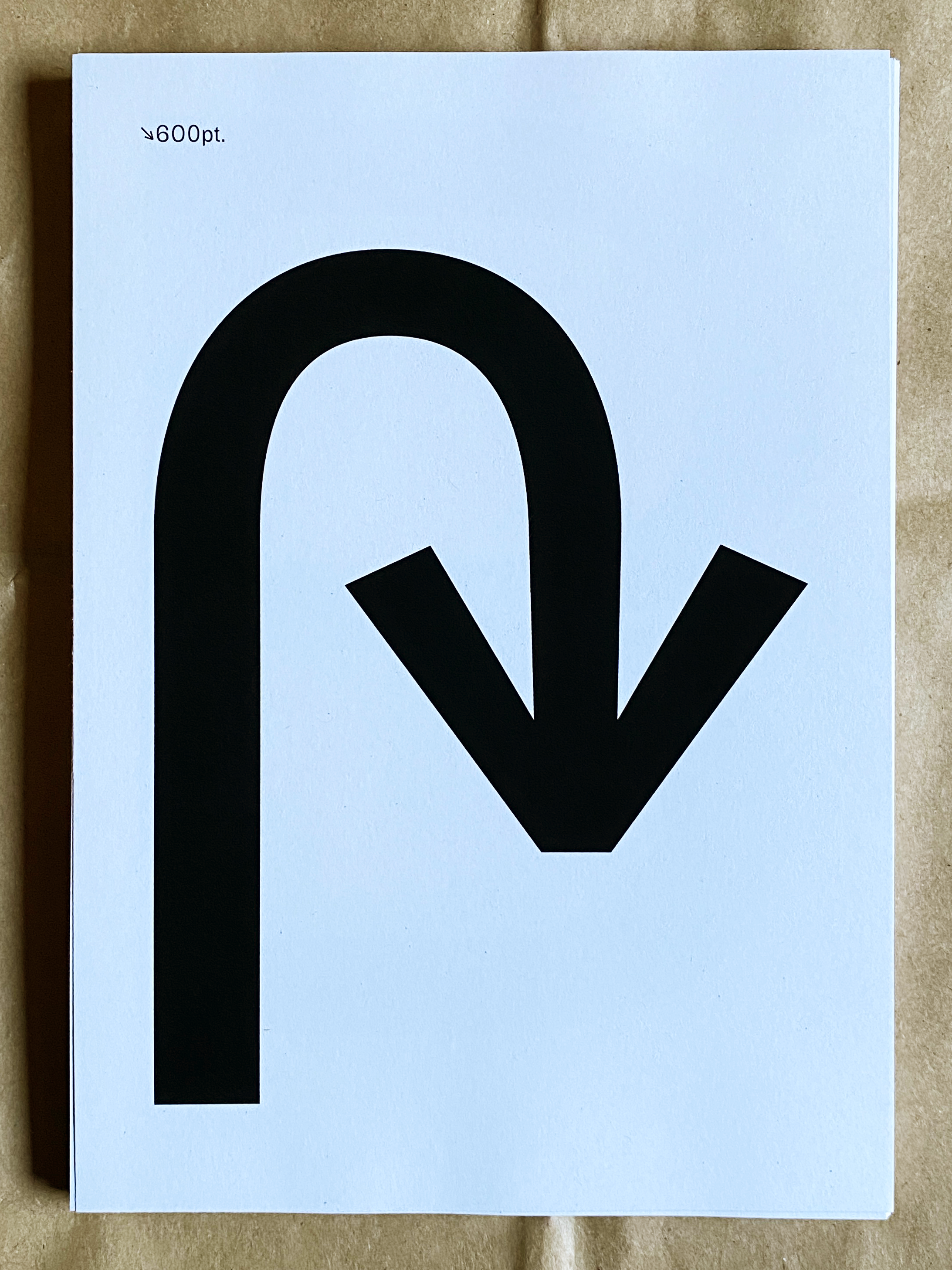
However, it also leans into its genesis of Brunswick signage. If you were to walk up and down Sydney Rd Brunswick, you would spot these designs.
Designs designed, without conventions. Purely matching placement, relative size, and colour to the existing signage developed by shopkeepers.
